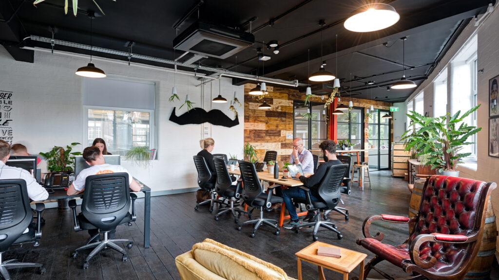
Too much ugly in your office design? Switch cramped and cluttered for cool and curvaceous, and give your visitors a serious case of office envy!
It’s Friday afternoon. Your best friend has popped around to your office, and you’re off to sample the Buddha Bowls at Whitecross Street Market. You shut down your laptop, grab your bag and rush to meet your friend in reception.
You find her standing beside a maze of boxes, scrunching up her nose like she’s smelled something rotten. “I wasn’t sure if I had the right place,” she says, gesturing at the putrid green walls. “Seriously, how can you like working here?”
Talk about feeling the shame.
Brilliant ideas for swoon-worthy receptions
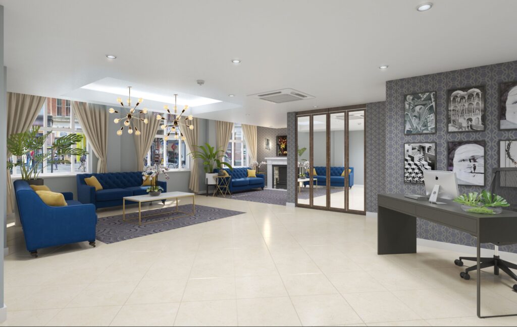
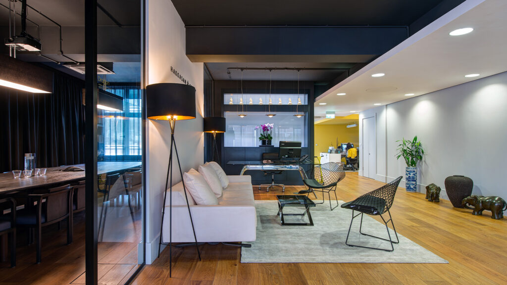
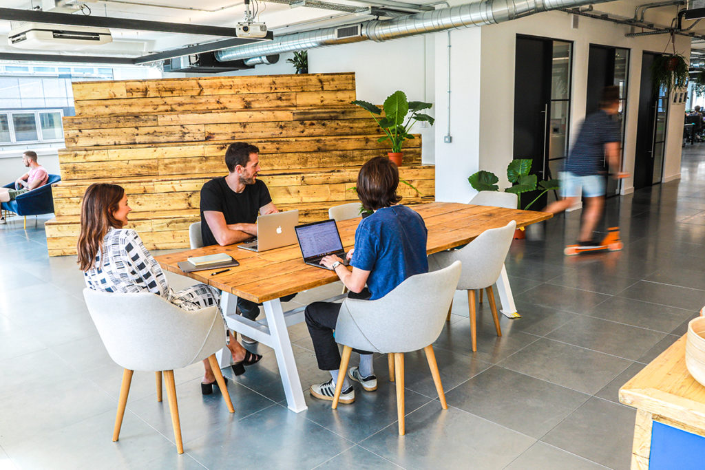
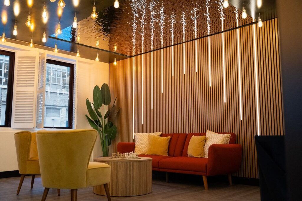
Luckily, there are countless options for turning your limp and lifeless entranceway into an envy-inducing machine. Here’s a mini-glimpse into some reception spaces that we think are very accessible and inspiring. The type of spaces you look at and think “yes, we could do something like this!”
First up, check out this colour-popping interior fit out we did for Currency Cloud. The orange is unlikely to be forgotten in a hurry, and the doorway graphics are a bit like one of those stuck-in-your-head advertising jingles – clever, catchy, and the branding appears effortless. This bold reception space shows that the payment platform is certainly – ahem – on the money when it comes to impactful design. Don’t just tell ’em who you are – sock it to ’em!
Hello gorgeous! This design visualisation for Zopa is full of our favourite things. Squishy, fall-asleep-in seating. An elegantly muted colour scheme that drips competence. Big and bold graphics that (literally) illuminate the brand. Corner tables that double as a computer table so guests can use their laptops while waiting. Super-smiley front-of-house staff (that one’s up to you). The whole design has a hotel-like ambiance. We reckon it oozes smooth.
Talking of smooth, this Dawson House design is pure Pinterest Gold. Check out the sleek and streamlined layout with oodles of space for traffic flow; strong visual sight lines to the reception staff; sophisticated lighting and high-brow colour palette. This reception screams professionalism. You? Embarrassed by this workspace? Never!
Great office design makes you credible. It makes visitors think, ‘these people are cool.’
You only get one chance to make a first impression. So, if you don’t like your reception space, then change it. Ditch the dinosaur that delivers nothing, and smash it out of the park with brilliant office design that makes you and your colleagues feel proud.
How? By following these three simple steps:
1. Grab your phone or tablet.
2. Search for designs that you’re passionate about.
3. Create the mouth-dribbling ‘wow’ with extra special touches. Pamper visitors with a relaxing foot hammock. Get playful with video games in the lobby. Show your cosmopolitan side with a cheeky juice bar or fully stocked fridge.
(Or you could just call the office fit out experts at CCWS and we’ll give you some ideas to get excited about!)
And the next time your friend arrives at your hip and stylish reception, please let her sit there awhile. You wouldn’t want her to leave without a serious case of extreme office envy, now would you?
Need design inspiration? Visit our collection of jaw-dropping reception space photos on Pinterest here.


